
The training landscape is constantly changing and evolving. With mobile phones and tablets becoming more common and easily accessible, many organizations are turning to mobile development for their training needs.
When developing a new training program, one of the earliest steps in the process is to determine how it will be presented to your learners. Will it be an eLearning module, a training video, a webinar, a live instructor-led training, or something else entirely? For many of these options, the training environment should be considered as early as possible to ensure there are no technical limitations that could hinder development.
As technology continues to advance, older training machines are struggling to keep up with the curve. With support for Flash coming to an end soon, it’s becoming more common to see these old computers replaced with newer, cost-effective training devices (such as tablets, mobile phones, or even MP3 players). But with new technology and new devices come a new set of challenges and considerations that will have to made by eLearning developers and project managers alike.
Here are 5 tips and tricks you will want to keep in mind as you brave the new territory that is mobile development.
Designing for a Device-Friendly Experience
As our culture shifts towards a more mobile-friendly environment, so should our design choices. With that in mind, what does “mobile first” actually mean? It’s important to distinguish that mobile first does not mean mobile only.
It simply means that the primary platform is a mobile device first and foremost. However, these programs are typically responsive and will still look good on any size screen. On a handheld mobile device, these programs should be “designed for thumbs” – a term used to describe the practice of keeping important user interface (UI) elements within range of the average human thumb.
Identify the Devices You Will Be Using
The first step you will want to take when developing for mobile is to identify the devices you plan to use in the final release. When listing these devices, it’s important to be as specific as possible, making special note of the device’s model number, operating system (OS), preferred browser, and any hurdles a learner might encounter when using this device (such as network or bandwidth issues).
To start, you should determine a single specific device as your primary platform. This is the device that will be most commonly used throughout your organization. Once a primary platform is decided upon, all future development will be verified against this platform, ensuring that the majority of your learners will have a seamless experience.
After you have established a primary device, you can determine secondary devices that you would also like to support. Keep in mind, supporting multiple devices will add onto your development time, as you will need to design for each new device.
Decide on the Best Mobile Design Strategy for You
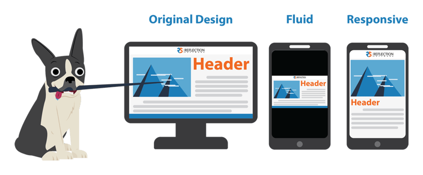
In web design, there are many techniques for creating pages that look good on devices of different sizes. In general, these mobile design strategies fall into 2 basic categories:
- Fluid – This technique essentially stretches the course to fill the window. The layout of the page will only have to be designed once.
- Responsive – This technique uses special code to ensure that each element of the page adapts to different device sizes. The layout of the page will need to be designed and adjusted separately for each screen size you need to account for. Typically, this includes creating unique layouts for large screens, tablets, and mobile devices. You may even need to design variations of each based on whether the device is being held portrait or landscape.
In some cases, your design can reflect both of these strategies. For example, the content itself may stretch to fill the window, while the navigation buttons are wrapped into a responsive layout.
If you are having trouble deciding between the options, I recommend trying to visualize the end-user experience and talk it through with a team. The choice often will become apparent during these conversations. You will want to ask:
- Does the module need to be designed for “mobile first”? If so, is it okay that this same layout is stretched up to fill larger screens?
- Does a unique layout for each device enhance the learner’s experience?
Choose the Authoring Tool that Fits Your Needs
Once you have decided on your mobile design strategy, you will need to choose an authoring tool (if you don’t already have one). Each authoring tool handles mobile design differently, so you’ll want to research them thoroughly and find one that suits all (or most of) your needs. For example, some authoring tools are better suited to handle responsive graphic design, while others are geared more towards building out custom functionality.
Choosing an authoring software can be a daunting task. You want to find a program that is not only easy-to-use and dependable, but also allows versatility and customization. After all, not every project is created equal.
Keep It Short, Silly
A good mobile design strategy isn’t just about thoughtful web design and graphic design – it also needs to be carried through your instructional design as well. These days, most people have become accustomed to having a wealth of knowledge at their fingertips. As such, they expect information to be quickly accessible in bite-size, easy-to-digest chunks, especially when using a mobile device. This new way of thinking should considered when developing training for today’s learners.
Microlearning is a growing trend, and for good reason. Not only is it cost-effective and quicker-to-market than traditional eLearning, but it promotes better knowledge retention, too. There are many additional benefits to microlearning, as discussed in this article.
As technology and our learners continue to evolve, we must do our best to adapt and stay ahead of the curve. We have to keep our ear to the ground in pursuit of continuous improvement. With these tips in your repertoire, I hope that you will feel informed and confident when making decisions on the mobile design of your next eLearning project.
Have some more questions? Still a little fuzzy on the differences between fluid and responsive design? We're here to help! Leave a comment below or get in touch to discuss what mobile design approach is right for you!
