
Color is all around us! It’s something we see, experience, and interact with every day. Most of the time however, it ends up taking a back seat in our minds. Because of this, it can be easy to forget just how major the impact of color can be. As artists and designers, being color conscious can be very beneficial in keeping your work outstanding, emotional, and accessible. Here’s some important color related things to keep in mind when designing.
Color Theory
Deciding on colors for a design might seem like a daunting task, but what if I told you there was an easier way? It’s called Color Theory, and it’s the study of how colors interact with, and relate to one another.
I’m sure we’ve all seen a color wheel at some point in our lives. But how many of us have ever actually utilized one? A color wheel is like a cheat sheet for making excellent color choices. This is done by examining a color's relationship to other colors via its placement on the wheel. There are scientifically good color combinations you can make, simply by knowing these placements. The relationships based on these placements are known as color schemes.

No matter what color you’re starting with, simply by utilizing one of the several schemes represented on the wheel, you can easily find colors that will match it. There are even many online tools that can help you make these choices, without having to memorize the schemes themselves.
Once you have a color scheme picked, now it’s time to work on creating a color harmony. Think of this, as making slight optimizations to the colors you have chosen to ensure they draw the correct amount of attention to themselves. For example, using the complimentary color scheme from the chart above, when you put these two colors right next to each other, they visually compete with each other.

This is where concepts like value and saturation come into play. The value of your color refers to its level of brightness or darkness. Saturation, or the intensity of your color, refers to how potent or pure it is. Colors that are brighter and more saturated tend to draw more attention than colors that are darker and less saturated. Having highly saturated, bright colors right next to each other can be overwhelming to viewers and should be generally avoided. By adjusting these elements, you can improve your color harmony, allowing your colors to work together rather than compete with one another.

Color Psychology
Have you ever noticed that eco-friendly brands tend to always have green in their logos? What about all the fast-food restaurant chains that use red? This isn’t just an aesthetic coincidence; these brands are using their colors to advertise to you without you even knowing. Color Psychology is the idea that color inherently provokes some sort of emotional or behavioral response within the human body.
Let’s use the Starbucks logo for example. When you look at this logo what does it convey to you? Like you’re ready to sit down and enjoy a nice cup of coffee? Now look at what happens when I switch that nice, serene green to red. Changes the vibe, doesn’t it? In fact, it makes it kind of terrifying. When you make a choice about color, you make a choice about how you want to be perceived.


Being intentional with your color choices is essential in making your work cohesive. If you’re creating something that is intended to be calm and relaxing, you may opt to use more cool tones like greens and blues. Whereas if you are looking for something more high energy, you might gravitate towards warm colors like reds or yellows. Saturation can also play a role in its emotional response. A dull, muted pink will not give you the same response as a bright, neon pink. Higher saturation provokes stronger emotional responses. So, even though you’re technically using the same color, by changing the intensity of it, you change the response as well. If you’re looking for more information on the emotional effects of certain colors, try checking out this site here.
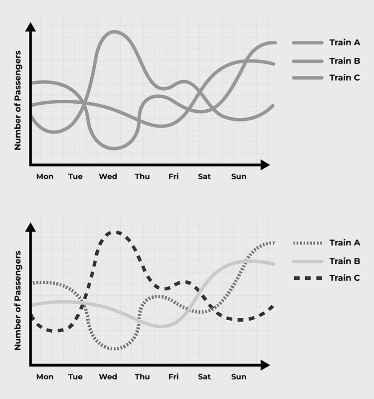
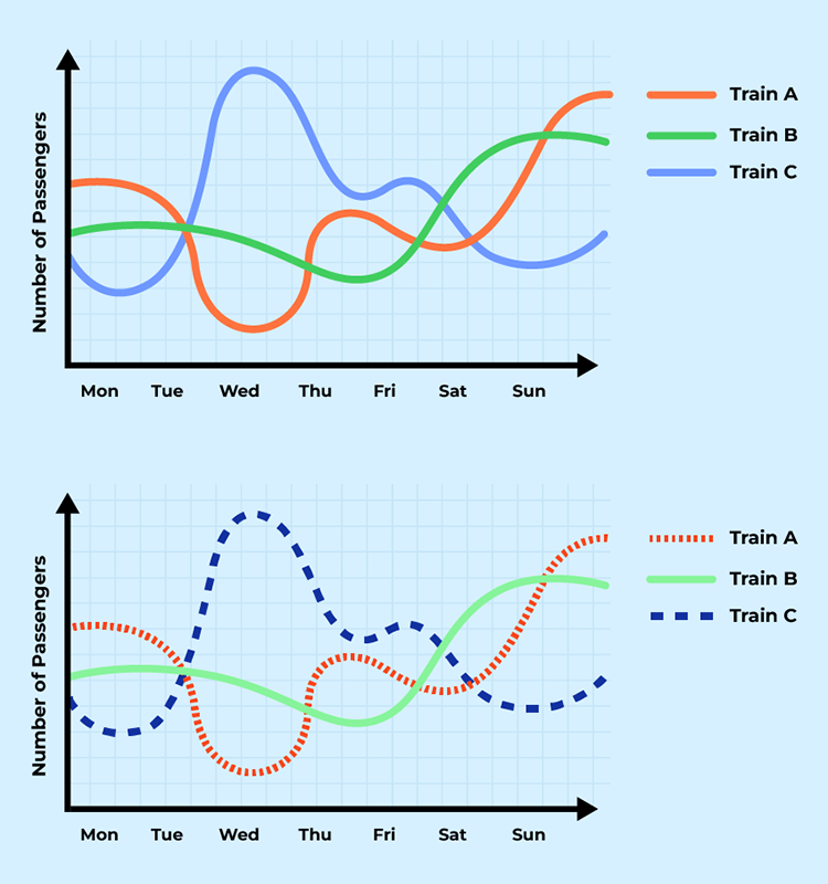
Poor color psychology can also affect the readability of your work and inadvertently change the message. Take a look at the charts below.

Even though both charts display the same statistics, it’s easy to misinterpret the one on the left as if Stores D and E are underperforming, even though the opposite is true. This is because red tends to imply negative results, where green typically implies positive results. Making the chart on the right a much more intuitive depiction of the data.
It's worth noting that color psychology is heavily influenced by culture, meaning not everything is fully universal. The example I gave above is from the perspective of someone who’s from North America. In other parts of the world, these colors might have a different meaning. This is something to keep in mind if you’re developing content for worldwide distribution.
Accessibility
Lastly, it’s important to remember that not everyone sees color in the same way, so keeping accessibility in mind is important.
According to the Colour Blind Awareness Organization “Vision deficiency, or CVD… affects approximately 1 in 12 men (8%) and 1 in 200 women (0.5%)”. People with CVD struggle to distinguish between certain colors. They can also have difficulty identifying the value of a color, and its level of saturation. “The most common type of color vision deficiency makes it hard to tell the difference between red and green. Another type makes blue and yellow look the same. In rare cases, people have complete color vision deficiency, which means they don’t see color at all”, noted by the National Eye Institute. The solution for this issue isn’t to abandon using color entirely, but to make some small changes to ensure your work reads strongly regardless of color choice.
For instance, color should not be the only way information is conveyed to your audience. If you have important information highlighted in red, you may opt to also have that information scaled larger on screen. This way, regardless of what colors you choose, that additional emphasis can still be understood by the viewer. Ideally, try and think of color as a secondary modifier used to strengthen designs rather than the only signifier of important information.
Another important accessibility factor is contrast. Contrast refers to the use of elements that are visually different. Work that is high in contrast will be easier to interpret and read. For example, even when the color is removed from the image below, it is still easily legible because of the strength of the contrast. This is something that is applicable to every person reading your work, and not just those with a color vision deficiency. Online sources such as this contrast checker can be used to help you discern the contrast of your work.
In many ways, you can think of color as a second language. It’s conveying information to your viewers without the use of any words. This is why it’s always important to design with intention and truly think about the message and information you want to convey, as well as what you’re using to convey it. Color is something we see, experience, and interact with every day, so taking the time to truly understand it can really make a huge difference in your designs.
Helpful Sites
https://color.adobe.com/create/color-wheel
https://www.canva.com/colors/color-wheel/
https://londonimageinstitute.com/how-to-empower-yourself-with-color-psychology/
https://webaim.org/resources/contrastchecker/
https://www.reflectionsoftware.com/blog/steps-to-integrate-accessibility-into-your-online-learning
