
Whether you’re creating video content, developing an eLearning, or even just putting together a PowerPoint presentation, chances are you’re going to be utilizing on-screen text to help illustrate your points.
On-screen text, or OST, can be a great way to help enhance and support the information you are presenting to your learners. However, your text can go from a helpful learning tool to an ineffective and even detrimental factor to your learning if it’s poorly executed. That’s why it’s important to keep in mind some basic design principles when creating your on-screen text. Even if you’re not a design expert, incorporating a few of these tips into your work can really help improve its quality. Let’s break it down into a few easy steps.
Simplify your Message
First, you need to simplify your message. Ask yourself some questions about your content.
What are you trying to convey?
What do you want your learners to take away?
Prioritize this information over “busy” details that may add insight to a topic, but aren’t necessary for a learner’s understanding of the material. Find out what the important points or message of your content is and focus on that.
Keeping OST short and concise is important because large bodies of text can be overwhelming to viewers. Long-form text typically creates a large vacuum of space where the audience is overloaded with new information, but not actively engaged in the learning process to retain that information. If you do have a lot of information to cover on a single slide, consider chunking out your content into short bullets or timing it with any voiceover audio that might be playing.
Large bodies of text can also take up precious “real-estate”, or space for other helpful materials like images or graphs. While OST can be used to help enhance and support the message you are delivering, in a perfect world, it should not be the only way your audience receives information.
OST Best Practices
The most important aspect of any OST design is its readability. After all, if your learner can’t properly read your text, then the information you are presenting will be useless to them. No matter how colorful or flashy a design may be, if it compromises the readability of the material, it is a poor aesthetic decision. Let’s break this down further into a few simple elements.
Fonts
Fonts should be simple and easily legible. Avoid ones that are overly complicated when presenting information to viewers. Generally speaking, sans serif fonts are considered easier to read for digitally displayed media as compared to a serif or scripted font.
Font Chart

Overly Complicated Fonts

In addition, avoid the use of title caps when writing full sentences. Title caps make all your letters equivalent in size and height, making it much harder for your brain to differentiate between them. These can work very well to help emphasize a title or header but should be avoided for phrases including more than just a couple words. Standard sentence caps is ideal for longer phrases. The varying letter sizes make your words more visually distinct from each other, which in turn makes them much easier to read.
Title VS Sentence Caps 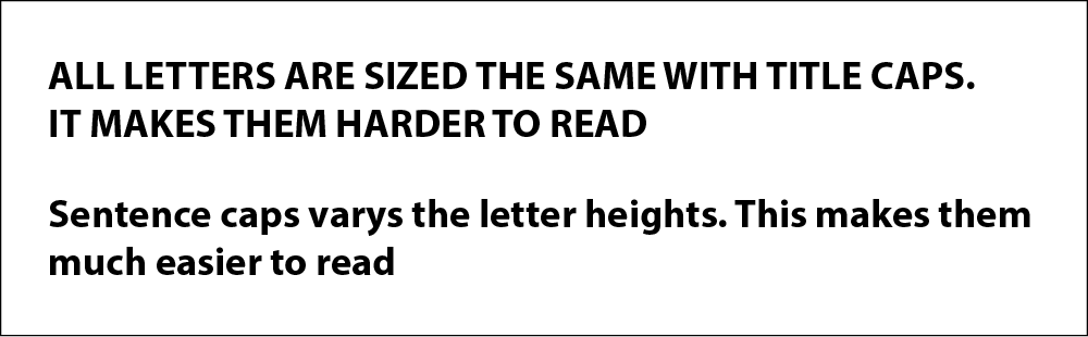
Colors
When it comes to colors, use ones that will have a high contrast against your background or image. Contrast can be easily thought of as the level of diversity between the objects you are presenting. Simply put, colors with similar values will have less contrast than objects with significantly different values. Higher contrast makes for easier visibility.
If you are unsure about whether your text is contrasting enough against your display, try turning the image black and white. This is a handy trick artists use since a grayscale image will more accurately display the genuine value or “shade” of the text. Basically, it simplifies an image for your brain, and makes it a lot easier to decipher the level of contrast between two objects.
|
Contrast Chart
|
Value Level
|
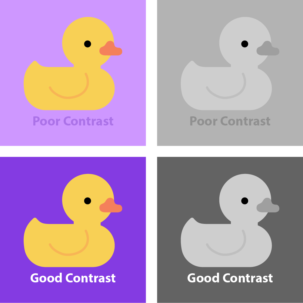

Color contrast is also an important accessibility consideration. Learners with a lower level or vision, or learners who are color blind will have an easier time reading your text the higher the contrast is. If you’re still not sure if your colors provide enough contrast, try using an online tool like this Contrast Checker.
Visual Hierarchy
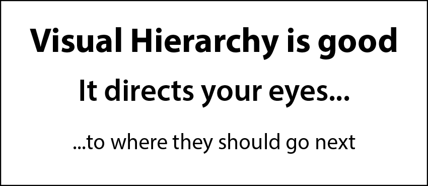
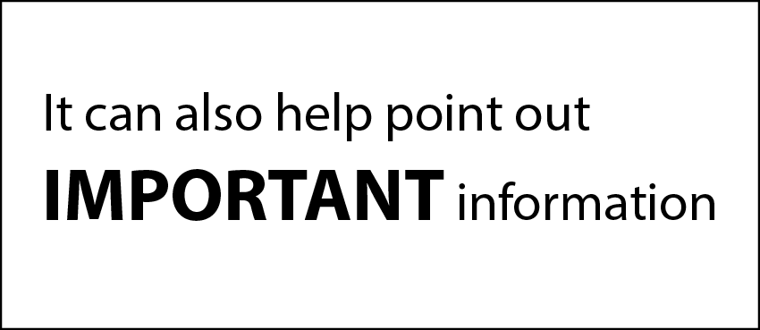
Displaying the elements of your design in a specific way to express their order of importance is a design principle known as visual hierarchy. A strong visual hierarchy will help you direct your audiences’ attention to the appropriate locations. Keeping a few of these elements in mind while creating your designs can help you add emphasis where it is important in your OST. For example, scale is a way to add extra emphasis to a block of text. If you have a word or phrase you would like to stand out more, simply try enlarging it. Larger items will be seen as of greater importance, and or will draw more attention.
Another way you can easily express a visual hierarchy is through the alignment of your text. As a western audience, our viewers are naturally inclined to read from left to right. Therefore, information presented from the left is likely to be seen and read first over other elements visible on the page. For more information regarding other elements of visual hierarchy, visit this site here.
 |
 |
Incorporating Motion
So, you’ve incorporated these best practices into your text, but maybe you want to do more. A great way to keep learners more engaged in your content is to add some type of motion to your on-screen text. Actions speak louder than words after all, and even just a very basic form of animation can do a lot to add some visual flair to your text. It also doesn’t necessarily require much effort to implement.
For example, PowerPoint has animation presets already built into the program; allowing you to add motion to your text with a simple click of a button. Or, if you’re taking a more video-oriented route, programs like Adobe After Effects or Premiere Pro have many effects and presets that allow you to achieve some pretty cool motion effects, even without an advanced knowledge of the program.
When using motion with your text, stick with simple movements, and have things appear on screen as they are mentioned. This allows viewers to focus on the topics at hand, and it gives them an indication of where their attention should be placed. It also gives the viewer a sense of progression and momentum to the learning process. Instead of sitting staring at static text, we are continuously adding to their knowledge with each point which makes it far more likely for us to hold their attention.
When adding motion, consider the amount of time, or duration, for which your text will be displayed on-screen. As a general rule of thumb, a viewer should be able to fully read through your OST twice before it is removed from the screen. This will allow them enough time to fully read and comprehend the information that is being presented to them. Moving too fast through a presentation is an easy way to lose and confuse your audience.
Keep in mind that motion is meant to enhance the text you have, but once again it should take a back seat to visibility. Don’t make it distracting. If it inhibits the audience’s ability to read the text, then the motion is unnecessary.
Get Designing
The design of your on-screen text is an important aspect of any presentation or eLearning. No matter how strong or impactful the information you are presenting is, poor design choices can easily cripple a learning experience. Keeping in mind just a few of these OST best practices can have a major impact on the information you’re presenting and how it is perceived.
Check out these tips in action with an example from our portfolio below!
How are you integrating design principles in your training? Learn anything new you’re excited to try out? Let us know in the comments!
