Whether it was lectures in college, the latest L&D conference or webinar you attended, or even a quick online learning course, you’ve probably experienced learning via a presentation format. This also means you’ve probably found yourself in a similar situation to the following scenario: You’ve settled in for an engaging and fruitful learning experience, with coffee in hand (black with a dash of honey and cream for me), pen and paper at the ready (I’m old school – I have a pencil!); you’re ready to soak in every last drop of information you’re sure this session will deliver.
And then – it doesn’t happen...and you find yourself even more grateful for that coffee in your hand, because it’s the only thing keeping you awake. You may even need to get a second cup!
So, what happened?
The topic was appealing, the session summary made it seem like it would provide valuable information …. but then the visual presentation of the content felt more like a scene from Ferris Bueller (“Bueller…..Bueller”) than an uplifting delivery of relevant content.
Now for the really important bit –how do YOU stop the “coffee effect” from happening in your own presentations? Whether you’re putting something together for a quick team huddle, as a learning tool for your business, or for your next TED Talk (hey, we all have our dreams!) here are some quick tips that will stop your audience from reaching for that second cup of coffee.
The adage really IS true – less is more
Every ‘top tips’ article about presenting that I have come across all state this as one of their top suggestions – limit what is on your slide to only show the most critical information. Here’s a deeper dive into ways you can make this happen in your presentations:
- People will be distracted squinting at teeny tiny type, instead use visuals that complement your message to elicit more of a reaction and support with retention.
- You shouldn’t be spending longer than 20 to 30 seconds on each page or slide – make sure your points are short and concise with a story or theme to thread them together smartly and succinctly.
- Don't repeat out loud words that are on the slide - information is interesting only once, and hearing and seeing the same words can feel repetitive. Focus on telling the story and have what you put onscreen be your supporting points.

A picture truly can say 1,000 words
My husband and I were lucky enough to travel to Paris for our honeymoon and had set aside an afternoon to go to the Louvre. I have some knowledge about art history thanks to my Mom, but I don't think anything could have prepared me for how a single painting or sculpture spoke a story that could evoke so much emotion.
Keeping this in mind, consider how your story can be told with an image instead of simply text and bullet points. You can source imagery and video from sites like iStock or Getty, or if you have this type of support, look to enlist the help of a graphic designer that can take all of your wordy points and transform them into visuals that will hold your audience’s attention.

There may be another way
Going back to the Harvard Business Review article How to Give a Killer Presentation, "Many of the best TED speakers don't use slides at all, and many talks don't require them….if you're going to use slides, it's worth exploring alternatives to PowerPoint."
While most of the speaking opportunities I have require some type of PowerPoint presentation, if there is an opportunity to explore the slide-by-slide delivery, shake it up! Products like Prezi, Haiku Deck, and Visme all offer alternatives to the sometimes-overused standard PowerPoint setup.
Nothing can replace passion
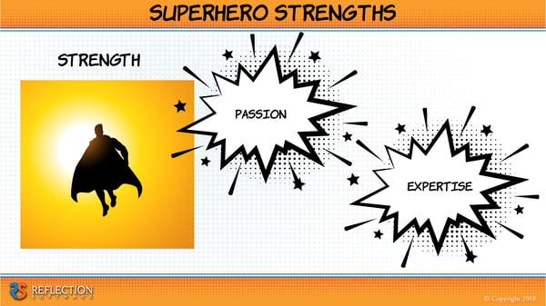
This is true for any range of public speaking you do: conference presentations, internal team meetings, stand-up training for your sales personnel, or a learning nugget for all of your field associates - nothing can replace the passion that drives the content. If you have passion for the subject matter, your audience will feel that. Don't force yourself to bury content behind a bunch of text, beneath too much data, or under flashy colors. Let the passion of the topic be part of what drives the story and delivery, and then from there you can decide what could benefit from more text or visuals.
For example, if you are trying to convey the warmth and comfort that a perfect cup of coffee provides, listing that detail out in bullet point format won’t carry the same emotional weight and connection as showing an image. Think about using a photo of the perfect latte with feathered milk art, steam rising invitingly, resting on a table next to a window, waiting for you to come and wrap your hands around the mug.

See the difference? Keep that in mind for your next presentation and who knows, you might not even need to get the second pot of coffee brewing!
What other tips do you have when putting together presentations or trainings? Leave a comment below with your tips or any questions! We've got a few other tricks in our bag that we would love to share with you!


